Monday, 13 June 2011

May 10- Underwater Hotel


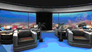
This is the Poseidon Undersea Resort of Fiji. It is the world's first seafloor resort and dives 40 feet into the Fijian Lagoon. 

 
This is the underwater lounge. It consists of a couple comfy chairs and elegant lamps.
I can sit here staring into the ocean all day!


The layout of the rooms is simple, as the focus is put on the underwater view. Each room includes a king-sized bed, a sitting room, a marble Jacuzzi, and 2 sinks. I wonder where the toilet is…

70% of the room is made of transparent acrylic plastic, providing an all-around view of the ocean. 


 I like this room because the dim yellow lighting gives brings a cozy feeling. The floors are shiny and polished which makes the room look classy and clean. The colour of the wooden-looking walls accents the neutral colour of the bed and furniture


I don’t like this room, mainly because of the ugly turquoise coloured bed and furnitures. The material of the floor and bathtub also make it look dark and old.


The overall atmosphere is comfy and romantic because the rooms are dim but brightened by the fluorescent glow of the water.


Sandy Leung (singles post)

Monday, 6 June 2011

Unique Beds

I found unique and cute beds on the internet.


This is a cute bed (: It looks very warm and cozy.  I first saw the top pictures I was confused why there was a picture of a giant cheeseburger, but when I saw the bottom picture I let out a big "OHH". This design looks very comfortable and warm. Its cute how the patty is the mattress, the lettuce and the top of the burger is blanket, and the tomato can be a pillow.  
 I've seen tons of sofa beds. But never something like this. When I saw this I was amazed. This sofa bed was design by an Italian Interior Design company, they have lots of room saving designs. All of their designs are easy to transform, the furniture won't be too heavy. Under both mattress there is a silent box spring underneath that elevates the mattress and makes it more comfortable to sleep in. This is a very unique design and can save so much room for people who have a limited space in their rooms.


When I first saw this bed I thought it was a very cute idea. However I was wondering if the top would ever accidentally close, although there is something supporting it. To me this would seem like a honey moon bed.


This bed is a life-sized replica of a bird’s nest. It even has huge white pillows that resemble bird eggs. In the shape of a nest, the bed’s curved sides make a soft wall, creating the feeling of a safe environment. The huge pillows also add extra comfort. This bed could also be used as playpen for children. I think this is a fun and cozy bed that anyone from a baby to an adult would love to sleep in.


This a cute bed design for little girls is both functional AND fun. Not only is it a bed, but it is more their own little playground. I would love to have this bed if I were still little. I personally like the tent built right over the bed because sleeping in it would feel like I'm on a camping trip, sleeping in an actual tent. It would make a regular night's sleep feel like an adventure. I also love the slide at the end of the bed. Since I am very lazy and tired in the morning, the slide would be very convenient, not to mention fun. It is every kid's dream to have a slide on their bed. The bottom of the bed is just an empty play area or could be used as storage space, but if this bed was mine, I would have definitely built a fort! :D


This is a custom designed treehouse bedroom. The whole room is painted as an outdoors scenery to match the theme. The designer even built 3-dimensional tree trunks around the room to add to the effect. The bed is the most interesting part. It is like having a bedroom inside a bedroom. Talk about privacy!  I guess I like being in small spaces because it feels more cozy, so this bed really caught my attention. It would be great if a swingset is added to the room. It would also be pretty cool to build a trapdoor that leads to the bed at the bottom of that tree trunk


Katie Chiu & Sandy Leung  (doubles post)

Monday, 23 May 2011

May 17th-Restaurant Designs- Modern Toilet

In Hong Kong and Taiwan, they have a restaurant called "Modern Toilet". This restaurant is basically based on a toilet theme. You sit on a toilet as your chair, you eat out of a small toilet and you either drink out of a urinal or toilet. I personally think it's a very unique and cute design and theme, however to some people it might not be very appetizing. I went to one of the restaurant while I was in Hong Kong last summer, I enjoyed it. I think that it's quite cool and defiantly a must go tourist place. Of course this is much different from a residential design, because normally no one would be sitting and eating out of a toilet.

 Here is the entrance to one of the restaurant. It's very colourful and eye catching.

 Here is a picture of the design in the restaurant, as you can see costumers would sit on an actual toilet seat, if you look closely the toilet seats that are closer to the wall have a pip connected to the wall and the toilet as a detail. The tables are two sinks with a glass top over it.
 This is different restaurant from the picture above, therefore the designs are a bit different. In this restaurant the table is a small bath tube with a cartoon doll inside it with a glass top over it. The seat again are actual toilets, however I much prefer these toilet seats because they have a back rest to them so you can lean back. It's cute that the seats have a little poo pillow.
 This is a decoration on the wall. I believe it's also a light. Basically its just the top on the toilet seats with different design.
 This is an example of how they restaurant serves the food. Continuing with the toilet theme, the food is served in a mini toilet seat, on the left is your drink in a mini urinal, and on the right is a poo, though I'm not quite sure what that is for, maybe just decoration. This is might be why some people might not find it appetizing because you are eating out of a toilet.
  As you can see, this is dessert. Now don't worry this isn't actual poo, it's just chocolate ice cream.


Single Post (Katie Chiu)

Saturday, 7 May 2011

May 2nd- 'green design' CARBOARD

If you are thinking of setting up a quick workspace or a temporary room on a low budget, you may consider using cardboard. Not being very useful, cardboards tend to be simply thrown away or recycled by most. However, a Dutch designer, Joost van Bleiswijk, and design director, Alrik Koudenburg, used these cheap throw-away material to construct a unique and striking office.

The designers used a “no glue, no screw” technique.” This is created by CUTTING and FOLDING sheets of 15mm honeycomb cardboard. Each piece is structurally stable and sustainable.

 
This office is built entirely from cardboard and contains everything needed- desk, shelves, table, even a staircase! I love that the designers created an upper level to the office. It is convenient and a smart way to save space. It is surprising that the cardboard is strong enough to support all the weight.


You can decorate the office by drawing on the cardboard columns.


The office even contains a meeting room with slide screen doors.


Sandy Leung (single post)


Thursday, 28 April 2011

Least Favourite Colour - Black

Technically, black is not a colour, but it is a widely popular “colour” used in interior design. I do like the colour black. However, I find it difficult to work with. Since black symbolizes darkness, evil, sadness, or even death, I think overusing this shade would make the room look very depressing.


Black is challenging to use as a base or background colour.
This bathroom uses black as its central colour. I think it looks terrible and honestly, quite creepy.  Using black on every wall, floor, and tile is unnecessary and makes the room look like a jail cell. The mood of the room seems to be cold and lonely, and it gives off the feeling of imprisonment.


Black is a difficult colour to use on its own, but it is excellent in matching with other colours. Black, as a neutral colour, is easily compatible with all sorts of colours. If I had to use black in my design, I would match it with bright colours, causing a dramatic and eye-catching effect. However, my favourite would be to pair up black with its contrasting colour, white. I think it is beautiful how the opposing colours accent each other and neutralizes its simplicity.


In this design, the colour black is successfully incorporated into bedroom. It has a nice ratio of white to black, which eases the darkness, yet it doesn’t take away the focus. The white wall corresponds to the black wall and the white closet balances out the black rug. The ceiling light is interesting because it looks dark and mysterious but illuminates brightness. The flowery patterns on the bed are playful, yet classy.


Black is a great colour to use in kitchens because it creates a modern look. Black coloured kitchen appliances such as ovens, stove tops, and refrigerators look very high-tech, but also tied together. Black marble counter tops can give a nice, glossy touch. Black would also look good with stainless steel, creating a futuristic feeling. Overall, I think black kitchens look elegant and organized. It is also great in hiding stains!


(Sandy Leung; Single Post)

Tuesday, 26 April 2011

Room Saving Designs

I was suffering through the internet and I found these cute and unique layouts for a small room, to save space. I picked out the three that I liked the best.

In this first one, I like the neutral colours with the pops of red. The neutral colours and very calming, but with the pop of red it adds more colour in the room, making it not a boring room.
I noticed that in the steps to the desk area, that the steps are designed to be drawers at the same time. I thought that was unique way of creating more storage space. Something I didn't like about this design was the pull out bed. I personally think that it's a big hassle.
 In this second design, it's nice and simple. I like the way the arrange the storage spaces. The designer didn't waste any space which is nice when you have to share a small room. I like how the stairs are at a small curve, it grab attention. If I could add something to this room. It would be a railing for the bed against the wall. Simply I roll around when I sleep, so I wouldn't want to have my leg hanging off the bed.
In this design, the first thing I notice and grabbed my attention was the colours in the room. One thing that I loved about this design was that it has two desks. I used to share rooms with my brother and I hated how we only had room for my brother to have desk in the room, and I had to work outside. So I like how they get their own desk and on space.  Like the previous design I would add some sort of railing to the bed up at the top, just for safety concerns.


Katie Chiu (Single Post)